


A few days ago I saw the new Angelic Pretty print, Chess Chocolate. My first reaction was that it was ghastly, shortly followed by the thought that it looks rather similar to Bodyline's Antique Clock OP:
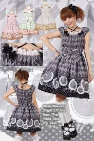
However, after the initial shock of Angelic Pretty releasing a print which isn't a sugary pastel explosion sunk in, I think the print looks promising from what I can see. Not too keen on the diamond pattern, but I suppose that is supposed to mimic a chessboard (although I would have preferred it to have a real checkerboard black and white look).
I think that if they release a true skirt (unlike that weird not-skirt-not-JSK thing) then I might be interested. I love that duck-eggy teal colour. The designs up already seem oddly shaped though, and I definitely would never buy them as they look unflattering and a little...cheap even. Also the lace looks a bit weird to me, especially the triangular type, but I think that may just be a prejudice due to the Melty Chocolate replicas, which look awful. A tad iffy about the gold for the same reason. Although thinking about it, Starry Night Theater has gold triangle lace and it looks amazing, so it is highly probable that I am worrying over nothing! But one thing that definately bugs me is the lack of brown in the centre of the dresses. That bow could do with being brown, or at least have a brown ribbon section underneath the bow that leads into brown waist ties.
The idea of a chess print is good though, as I have thought before that there should be one considering how many prints with playing cards designs there are. It's great to see what other things Angelic Pretty can do as well, as people often overlook many of their prints and come to the conclusion that all of their prints are diabetes-causingly sweet. And that just is not true.
And so on first look I am undecided and look forward to seeing more about this print! Perhaps by the time this has posted more information will be available and I shall have to edit my post! (Just discovered scheduling which is handy as I have a lot of things to write today it seems).
Edit://Looks like that weird looking thing is a skirt. Damn. HOWEVER! I have just seen on Tumblr that there is a brown colourway, and the JSK is looking mighty promising. Even so I must not buy it (even if I may want to).
What are your opinions on this print?
I love it to bits and pieces! All of it, actually. The brown JSK is probably my favorite, followed by the sax OP (too bad I look horrendous in sax) and closely by the cream (?) colored one. Personally, I'm really fond of diamond patterns and was excited when I first saw Bodyline's Antique clock... Though anything which is fully shirred makes me look like a chubby marshmallow, I don't like polka dots, and there really should have been lace on the bottom of that OP. It's like AP is making up for it. >.<
ReplyDelete